Florida emerged as a domestic relocation hotspot during the pandemic – and analyzing domestic migration trends over the past four years reveals that most newcomers to Florida have stayed in the Sunshine State. We dove into the data to find out just how big a piece of the domestic relocation pie went to Florida – and see where the newcomers came from, where they chose to settle, and which Florida destinations attracted the most affluent new residents.
Florida Received Almost 25% of Intra-State Migration Between 2020 and 2024
Domestic migration picked up over the pandemic, as many Americans liberated from the constraints of in-person work chose to move to areas with more space, a lower cost of living, and better outdoor recreational opportunities.
The map below highlights the states that received net inbound domestic migration between July 2020 and July 2024, with the percentages representing the share of inter-state positive net migration welcomed by each state during the analyzed period.
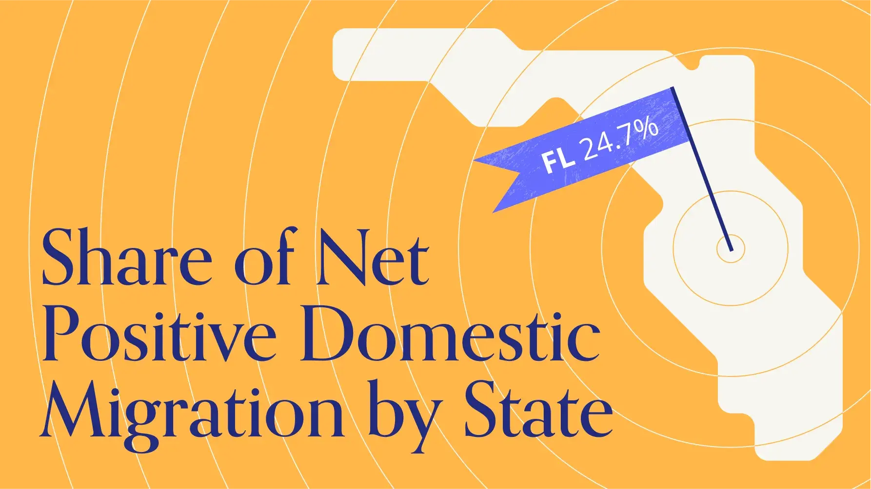
As the map shows, Florida was one of the major beneficiaries of the recent domestic migration boom. Between July 2020 and July 2024, Florida received 24.7% of positive intra-state migration in the United States. (In other words, 24.7% of inbound net migration to states with overall positive net migration went to Florida.) Texas, another oft-discussed pandemic relocation hub, came in second, receiving a significantly smaller 17.6% of the total inter-state positive net migration pie.
Most Newcomers to Florida Have Stayed in Florida
Most of Florida’s recent population influx dates back to the Covid era – diving deeper into the monthly data reveals that the biggest jump in migration over the past four years took place between late 2020 and early 2022. And although inbound migration slowed somewhat in 2023 and 2024, the Sunshine State’s net migrated percent of population compared to a July 2020 baseline remained steady at about 2.5% to 3.1% (depending on the season). This means that 2.5% to 3.1% of Florida’s residents have moved there over the past four years – indicating that most people who moved to Florida at the height of the pandemic have remained in the Sunshine State.
So where is Florida getting its new residents from?
New York and New Jersey Main Feeder States for Florida Inbound Migration Boom
Analyzing net migration to Florida by state of origin reveals that Florida received net positive migration from most of the country during the analyzed period – but the influx from some states was particularly significant.
The map below charts the share of net migration to and from Florida by state of origin or destination between July 2020 and July 2024. The purple represents states from which Florida received net positive migration – more people moved to Florida from those states than the other way around – and the percentage indicates each state's share of the total net positive migration to Florida. The yellow represents states which received net positive migration from Florida – more people moved to those states from Florida than vice versa – with the percentage showing each state's share of the total net negative migration from Florida.
As the data shows, much domestic migration to the Sunshine State came from the Mid Atlantic region – with relatively expensive New York and New Jersey standing out as the biggest feeder states – as well as from Illinois and California, two more high-cost-of-living states. Illinois and the Mid Atlantic states also tend to have relatively cold winters. Meanwhile, Florida mostly lost residents to neighboring states and to Texas, with a much smaller share of its net negative migration going to Alaska, Michigan, Montana, Wyoming, and the Dakotas.
It is likely, then, that Florida’s affordability and mild winters served as significant migration draws.
Central Florida Receiving the Bulk of Inbound Domestic Migration
People may be moving to Florida from all over the United States. But where are they moving to in the Sunshine State? Mapping domestic migration trends onto Florida’s metro areas reveals that most of the inbound domestic migration is concentrated in Central Florida. Indeed, just three Central Florida metro areas – Tampa-St. Petersburg-Clearwater, Orlando-Kissimmee-Sanford, and Lakeland-Winter Haven – accounted for nearly half (41.5%) of the total net positive migration to Florida during the analyzed period.
Different Central Florida Hubs Play Distinct Roles in Wider Migration Dynamics
Although the Tampa, Orlando, and Lakeland metro areas are contiguous, the demographic profiles of new residents settling in the three CBSAs are quite different. For example, Tampa, which boasts the highest median household income (HHI) of the three metro areas ($65.1K, compared to $61.1K for Orlando and $55.1K for Lakeland), also drew the greatest share of domestic migrants from affluent areas (median HHI > $100K).
Each of the three central Florida CBSAs also attracted newcomers from different areas of the country. Tampa exhibited the most diversity, with its top 5 CBSAs of origins representing under 50% of total net migration to the metro area. Orlando, on the other hand, received almost 50% of its net domestic migration between July 2020 and July 2024 from just two metro areas: New York and Miami. And for Lakeland, over 50% of the inbound net migration came from within the Sunshine State – including 31.6% from the Orlando CBSA and 9.5% from the Tampa metro area.
It is likely, then, that newcomers to Tampa are coming mostly from wealthy areas throughout the country, while Orlando draws slightly less affluent – but still relatively high-income – newcomers from dense urban areas. Meanwhile, Lakeland appears to attract local Floridians who may be looking for a more affordable living situation without moving too far away from their current communities.
Thanks to its mild winters, affordability, and lifestyle appeal, Florida emerged as a major pandemic relocation destination, and recent migration data reveals that many of those who moved in between 2020 and 2024 have stayed in the Sunshine State. In particular, the central Florida hubs of Tampa-St. Petersburg-Clearwater, Orlando-Kissimmee-Sanford, and Lakeland-Winter Haven attracted an outsize share of new Florida residents, with each metro area showcasing unique inbound migration patterns.
What will domestic migration patterns look like in 2025?
Visit Placer.ai to find out.


.png)
.png)

.png)
.png)


.svg)